Monday, 9 May 2011
Used Programmes
This is a brief overview of what the programme looked like, it was clear and enabled us to construct the production just the way we wanted it.
This programme, Blogger.com is essential in this project. Obtaining information about planning, editing, background information, the production itself and much more we have published it onto our page. Thankfully it has been generously easy to work with ...
Directors Comentary - Misunderstood
This is a directors Comentary on 'Misunderstood' spoken by Leah Fraser. It gives a clear yet breif overview of the production yet mainly focuses on the important shots used when filming. The conclusion of the production is left at a cliffhanger therefore allows the audience to interpret there own ending. Hopefully this provides an understanding of the production and the shots and why we chose them.
Saturday, 7 May 2011
Storyboard
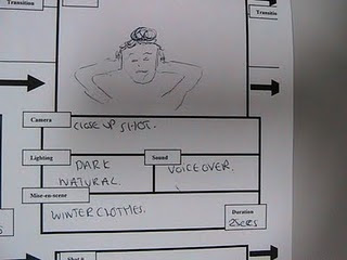
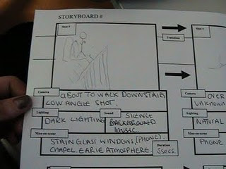
We focused on the main shots that will be in our sequence and thoroughly explained them, starting of with a sketch of the main character Leah about to walk down the stairs this was shown in a Low angle shot, the lighting was dark in this shot with a little light shinning threw the mosiac windows in the chappel hall where we recorded. To start this off there was no background sound what so ever which created a earie atmosphere.
This ran into an over the shoulder shot of an unknown number ringing Leahs mobile phone, it showed this clearly and was understandable, The lighting in this shot was natural and realistic, showing a brighter light coming from the mobile. No background music was played in this shot which still kept the earie atmosphere around.
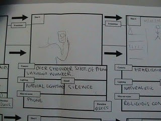
Establishing/ long shot of leah walking down the aile of the chapel, looking insecure and worried. Naturalistic lighting and the background sound just begining to start playing, this builds up tension for the audience as the music begins to get louder the closer she gets to the alter.
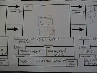
Extreme close up of mobile, showing information and making it clearler for the audience. A visible text "ill see you tonight.. " clearly apparent and background music is playing at a quite pace.
Insert/close up shot of "BoothBank Cottage" the name of the cottage Leah goes to for help. Realistic lighting and the background earie music still at the same level.
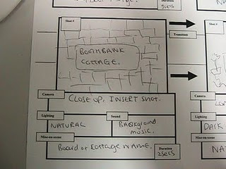
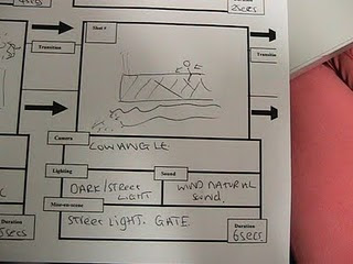
Low angle shot of Leah climbing over the fence into BoothBank cottage. Streetlight shining on the character and the fence, this shows her actions more visible and has the audience on edge, while questioning "why would she be climbing over a strangers fence?" background music at a steady pace and following the sequence well.
Friday, 6 May 2011
In what ways does your media product use, develop or challenge forms and conventions of real media products?
The main protagnist in our sequence is a female teen, aged around 16/17. She is presented as a calm and reserved individual who keeps herself to herself and takes great interest in her religious lifestyle. Some would say that In a way she somehow greatly subverts the general stereotype for the original everyday teen as for they are usually the total opposite of what this character is. They are generally hyper and dramatic yet our character is opposite this.
An example of the expectant behaviour of an everyday teen is in Legally Blonde. The main female protaganist, who is around the same age as our character is somewhat obsessive of the way she looks and favours her fashionable "party" lifestyle. This is extremely parrallel to our character considering the fact that all she cares about is her religion an wishes to remain peacful within herself and the church. Therefore this would challenge this particular media product but on the otherhand, it perfectly develops it overall. For instiance, in Legally Blonde you instantly make the assumption that the main character will lack common sense and not be very intelluctual. This is also the same in our product as you instantly assume our character is of "normal" mental health yet this is definitely not the case when it is revealed that she hears continous unwated voices. The fact that she goes agaisnt the audiences expectations is a comparision to legally blonde when she subverts all asumptions of her being 'ditsy' and lacking common sense but in realtiy she ends up becoming a lawyer.
What kind of media institution might distribute your product and why?
Wednesday, 4 May 2011
How does your media product represent particular social groups?
The girl in our product is part of a religious social group which is arugably not quite common in the 21st century amongst teens nowadays. She therefore subverts the everyday streotype for a teen of our generation as the typical streotype of female teenagers is to be purely interested in fashion/friends/boys etc. However, our character on the other hand has dedicated most of her time to the church and God. Another social group it could represent would be the Mentally ill, Leah appears to be an average teenager to begin with until the voice overs' beigin to differ and reveal the clouded indifference in Leahs mind. Confused by herself and others around her she is Misunderstood. In some ways it can represent Social class... the house in which Leah ran towards was a beautiful building in the countryside, it is for the audience to interpret the class of Leah however we will never find out who lived at that house and why she was there.
Monday, 2 May 2011
Music
How did you attract/address your audience?
Other shots included to allow the production to be more apealing would be tracking shots, low angle shots, establishing longshots, over the shoulder shots and many more...
Who would be the audience for your media product?
Our project would be given a 15 certificate in that it contains aspects that may be hard to understand by some viewers. For example: the voices the girl hears and her religious background. However, our project does not contain any extremities such as violence or horror aspects. The only dramatic features it includes is the psychological voice overs and the expressions given off by the girl. This is probably one of the main reasons why we have chose to give our project the certificate 15 as these may be features that anyone younger could not comprehend nor understand.
Seen as our product has a focus upon religion and potential mental health, it could essential be used to raise awareness about these focal points within schools and/or colleges. For example, our sequence could be shown in general r.e lessons and used as a discussion point for different lifestyles, ie- religious lifestyles and also people who suffer from mental health. This would be greatly benifical as for mental health issues still remain a slightly taboo subject and by intergreating them within a teenagers thriller film could urge more people to accept and break the taboo surrounding mental health. And so therefore overall, other members of the audience could be pupils. In addition this means our sequence would be used as an education feature aswell as an entertainment one.
Thursday, 14 April 2011
Looking back at your preliminary task, what do you feel you have learnt in the progression from it to the full product?
Tuesday, 12 April 2011
Pictures of Location
In our filming we had several shots of a character over looking the white blacony shown above. One of the shots included a panning shot of the character overlooking the field equipped with a pair of binoculers. Another shot was a medium close up of the character contently watching, which was followed by a close up of the character realising something which remains ambigious to the audience.
The building overlooked a park and a somewhat spacious field; this was benificial for us as we chose to have a park in our scene. The panning shot we took was of the character overlooking the park therefore the park was bound to be in the shot. However, we agreed within the group that if the park didn't look essential in the sequence, we would edit it in Edit cut pro software and develop a more of a field as opposed to a park.
However, seen as though we filmed two seperate sequences, these pictures are based upon our first location. We keep the somewhat same style but the house and enviroment we used createed an even more eerie atmosphere.
Our second location was in the extremely rural area of lyme. It had very spacious fields which we used to create the notion that there was an extremely anxious girl left alone. We used a longshot as she was walking steadily across the field. At this point the reader was left ambigious to the fact that she was either being followed by anothe character or her own mindset was playing tricks on her.
Another aspect of the location was the house in which we used. It was a very large cottage looking house named Boothbank cottage The house was equipped with a securely closed gate which had the sign "Guard Dogs-Beware" promidently labbelled on the gate. The use of this quiet, reserved house and locked gate created a feeling that the anxious girl was closed off from any form of saviour from what she was being chased by.
Wednesday, 6 April 2011
- Title "Pefect Pictures presents"
- Titlte of the film upon black backgroud
- Panning out shot from biblical picture - lands in a medium shot of girl sat in front of it
- Long shot of girl walking from being seated down the stairs
- Girl gets half way and phone rings - Medium shot of girl answering phone
- Over the shoulder shot of phone showing "Unknown Number"
- Resumed medium shot of girl speaking on phone
- Medium shot of girl walking down stairs
- Medium close up of girl opening and walking through chapel door
- Long shot of girl walking towards alter
- Establishing shot which opens followed by extreme long shot of the scenery & girl approaching
- Long shot from behind girl heading to stye/stepping stones (still showing the surrounding scenery)
- Close up of girls feet stepping onto stepping stone/stye
- Over the shoulder medium shot showing house and gate in background, girl heading towards road/house
- Over the shoulder long shot showing girl waving/shouting for help from the car
- Over the shoulder long shot opposite way showing car driving off
- Extreme close up of girl crying for help
- Medium close up of "Boothbank Cottage" sign, also showing girls shadow hovering over
- Insert shot of "Boothbank Cottage" sign
- Medium shot of girl walking to gate
- Continued medium shot of girl trying to open gate
- Worms eye view of girls foot begginging to climb over fence
- Medium shot of girl over fence
- Long shot of girl walking to house to gain help
- Close up of girl knocking on house door
- Tracking Shot of girl walking away from house door
- Long shot of girl walking towards girl #2 standing by horse
- Close up of girl requesting help from girl #2
Monday, 7 March 2011
Production Treatment for Main Task & Planning
The opening of a short thriller based film.
Duration - The length of the film is 2minutes.
Audience - Since our sequence is of thriller genre our audience would tend to be people who enjoy getting a thrill out of specific movies. As thriller movies tend to contain great suspense it would not appeal to middle aged woman who like calm romantic comedy's, as these genres contrast immensely. Our film also contains psychological elements which requires the order to make a somewhat psychlogical anaylysis. This could compare to the 2006 mystery thriller "The Da Vinici Code." Such elements are expressed through the protaganist getting flash backs from his past. They remain ambigious to the audience until a title actually informs them that "[his] past will always haunt [him]". The gender of our audience cannot be generalized because from my research (a questionnaire) both females and males enjoy thriller films. The age of our target audience would range from 15 + since the content of our film may be considered too psychologically disturbing for a younger person to comprehend.
Resume- An overall outline of our opening sequence begins firstly with a book placed upon an old table, the book is closed but is soon opened by a hand which is wearing a black leather glove. The owner of the hand is unknown at this point and there is no way of knowing whether they are male or female. As the book is opened the pages flicker until it falls onto another open page which consists of old cut out newspaper headings and slightly obscure photos. The presentation of a wall covered in the same newspaper headings and the previously mentioned photos is now presented. The wall is in a dark room, meaning the newspaper headings and photos are only just visible. A window is positioned next to the distinct wall. The owner of the previously mentioned hand is standing in front of the window holding a polaroid camera. The gender of the person remains unknown as their face is not shown. They are dressed in a bulky black coat which also confounds the audience as to whether they are male or female. The polaroid camera is directed towards a young girl playing with her bike, this can be seen by looking out of the window. The young girl rides off with her bike and is followed by the unknown character. As she is riding off she drops her bracelet which is then slyly picked up and handled by the anonymous person.
Suggested Elements-
Costume
Black gloves/Black duffel coat to disguise the protagonists identity.
- Red brogues to make the audience distinctly remember such shoes - associating them with the anonymous character.
- A girlie outfit to insinuate vulnerability and innocence of the little girl.
- A polaroid camera which the anonymous character uses to take bizarre photos.
- A child's bike
- A girls bracelet
- Old cut out newspaper headlines
- Old photos which are placed onto a wall covered in newspaper headlines
- A house which overlooks a park
- A child's park
- A big house consisting of a large window
Initial Shot List
- Medium shot of a book whereby the pages are flicking, until it opens on a page
- Black titles showing names of people involved
- Sprinkled effect leading into next shot
- Close up of the page it landed on, which consists of images of children
- Slowly pulling out of the close up shot into a long shot, revealing the mans hand placed on the book, trailing his fingers over the images
- Pan Shot moving towards a wall of disturbing images then continuing until the pan shot reaches a window
- Over the shoulder shot of the man taking a picture out of the window – through the window we see a young girl with her bike
- Zoom into the young girl playing with her bike and dropping her bracelet
- Close up of bracelet and mans hand reaching for the bracelet
- Pulling out of the close up – starting at feet panning upwards to show his hand holding the bracelet
Wednesday, 2 March 2011
Opening sequence -
We benefited greatly from looking at this opening sequence as we wanted to base our main task on the style of Se7en. We was firstly shown a close up of a book while the pages were flicking, that was followed by a blank black background that delivered certain credits such as the names of people involved. A medium birds eye view close up of a disturbing image was then shown with created a disturbing atmosphere so early on in the sequence. Non diegetic background noise is played over the shots to create a further eerie atmosphere for the audience. Certain effects were used in this sequence which we hoped to use in our main task, these effects included quickly cutting from one shot to another and a sort of blurry effect.
Monday, 28 February 2011
Opening scenes
As the sequence continued it became apparent that Clarisse was an intelligent woman considering she worked in a lab.
The use of the lab in the opening sequence also gave the audience the impression that the film is not only a thriller based film but had further psychological aspects to it. Furthermore her intelligence was again reflected through her high status job and the mid shot when in the lift with only men, who are in fact dressed in the same uniform which conveys her independence and confident attitude; allowing her to stand out from the crowd.
However the mid shot also shows that she is towered over by the males yet is not dominated in any way as she seems more relaxed in her surroundings as opposed to being tense or anxious.
Monday, 14 February 2011
Preliminary Task
Beforehand, we made a shot list of the different type of shots we wanted in our film. At approximately 22seconds we included an over the shoulder shot reverse shot. We used this shot to convey effect in the heated conversation between the two characters. The first shot shows character A (Leah Fraser) explaining that she isn't comfortable in her surroundings; the second half of the shot reverse shot shows character B (Rebecca Gorvette) replying to what is said to her. Each shot involves the characters expressing facial expressions which connotes the way they're feeling.
Most of our shots include match cuts which help fulfill standard continuity. We achieved one specific match cut by shooting a close up shot of character B opening a door handle; we then joined it with another long shot showing character B walking away from the door.
Prelimary task - Completed video
1.Long shot- character A walking towards the door across the room
2.Close up- handle of door
3.Close up- character A’s hand on handle
4.Medium shot- character A opens the door
5.Long shot- shows the room of chairs and tables and character B already seated
6.Medium shot-character B sat down on chair
7.Tracking long shot- character A walking to sit down
8.Long shot – character A and B sat down facing each other
9.Over the shoulder close up – Character A
10. Over the shoulder close up – Character B
11.Eye line shot from character A to look in the direction it cam from
Dialogue
Character A- ‘there something really creepy about this house don’t you think’
Character B – ‘ Ino there is an eerie atmosphere, I wish mum would come home’
Sound effects
Bang and a mans voice